

the bell club
brand personality
Grassroots / Friendly / Educational
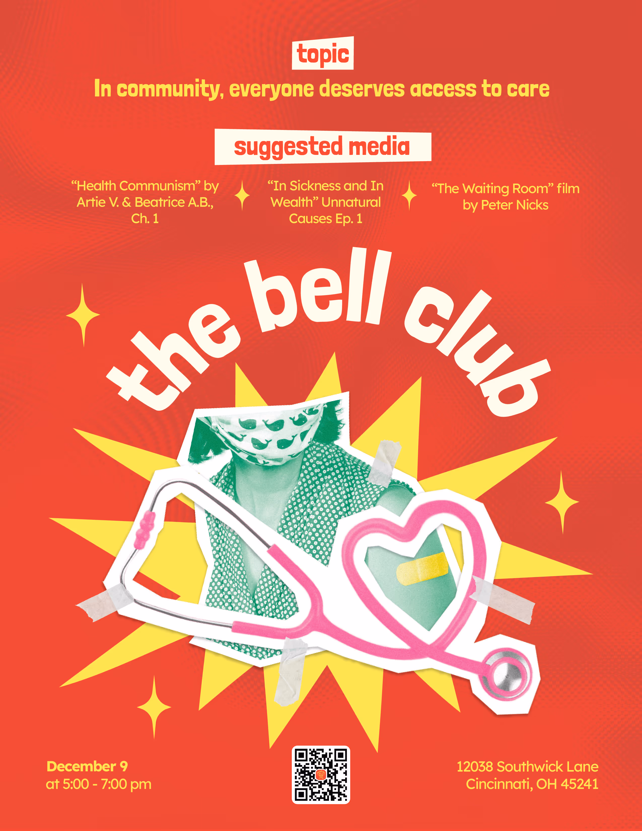
the bell club is a Cincinnati-based group for women and gender-diverse individuals to foster community and encourage education about the social and political issues that impact everyday lives.
the bell club is a Cincinnati-based group for women and gender-diverse individuals to foster community and encourage education about the social and political issues that impact everyday lives.
deliverables
In my time as the graphic designer for the bell club, I had the opportunity to mold their brand from the ground up. I began by conducting research, sketching, then once I adjusted according to feedback, I finalized the brand materials in Illustrator. Overall, I developed:
• Logo design
• Social media posts
• Posters
• Discord banner
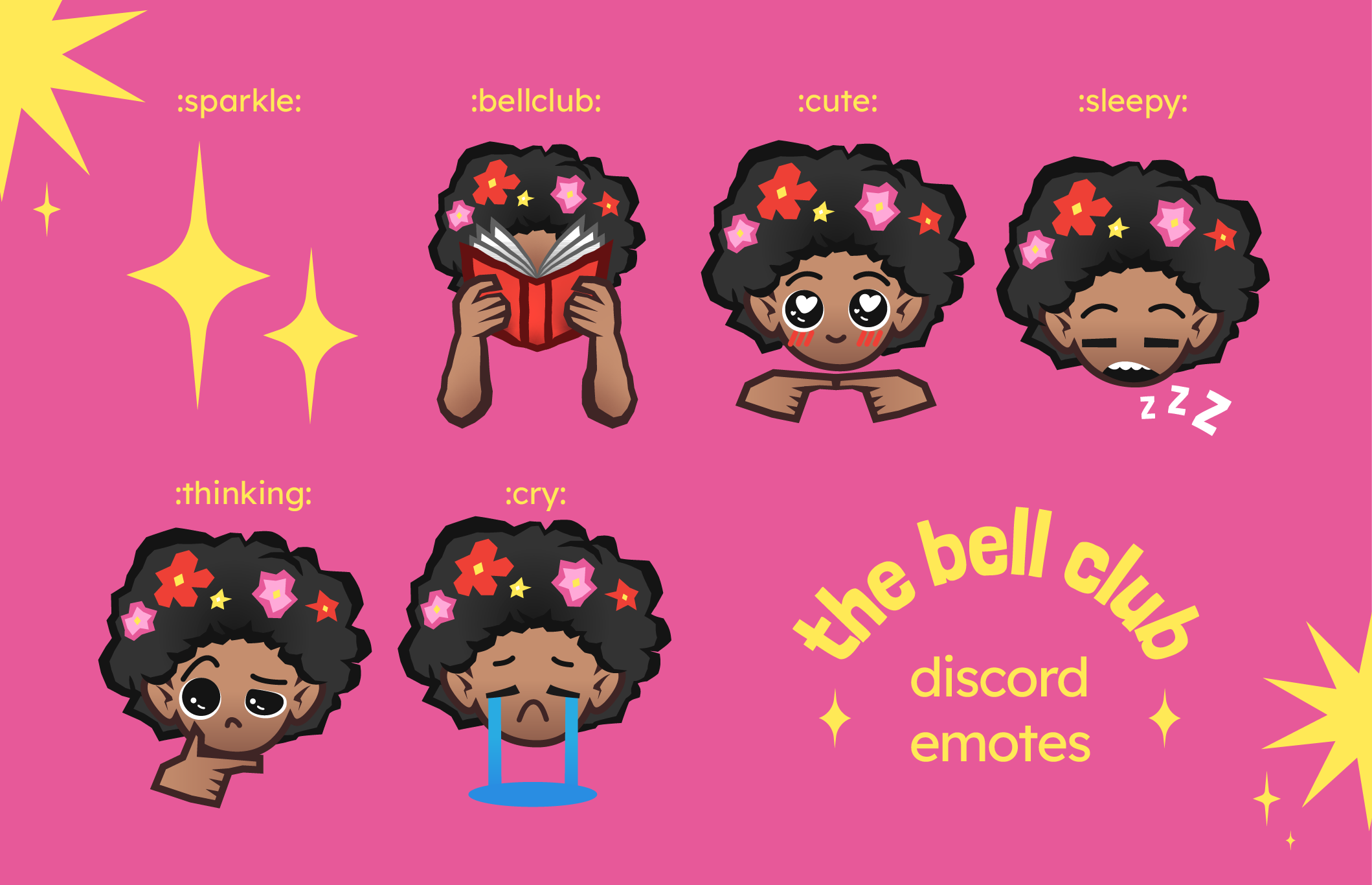
• Discord emotes
• Zines
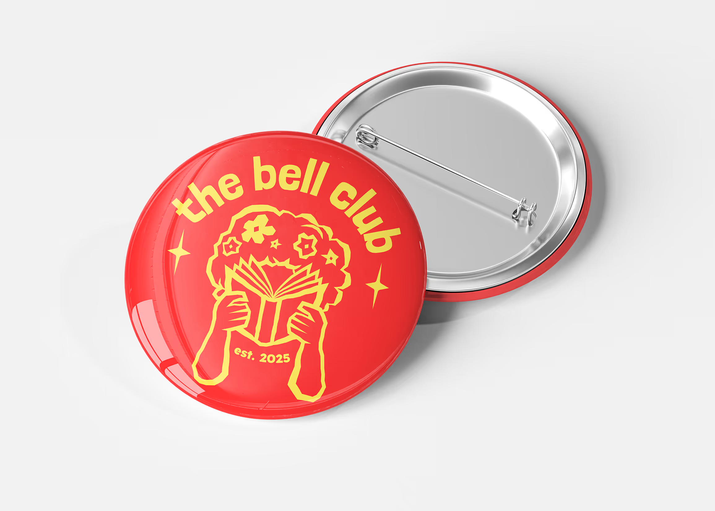
• Buttons
• & Other brand assets
• Logo design
• Social media posts
• Posters
• Discord banner
• Discord emotes
• Zines
• Buttons
• & Other brand assets


process
I began by conducting research of similarly politically-aligned social and revolutionary groups, evaluating the colors, fonts, imagery, and compositions used. I asked myself what did and didn't work in those designs, and how I could deviate from them while still preserving a unique bold look. I then narrowed down the visual styles, creating style boards and sketches that I used to interview club members and locals that fit into the target demographic of the club, gathering their input to eventually develop the club's visual identity.
The direction given by administration was that the club needed something with bold colors and distinctive iconography that represented their revolutionary grit and boldness, as well as their accessible approach to education.

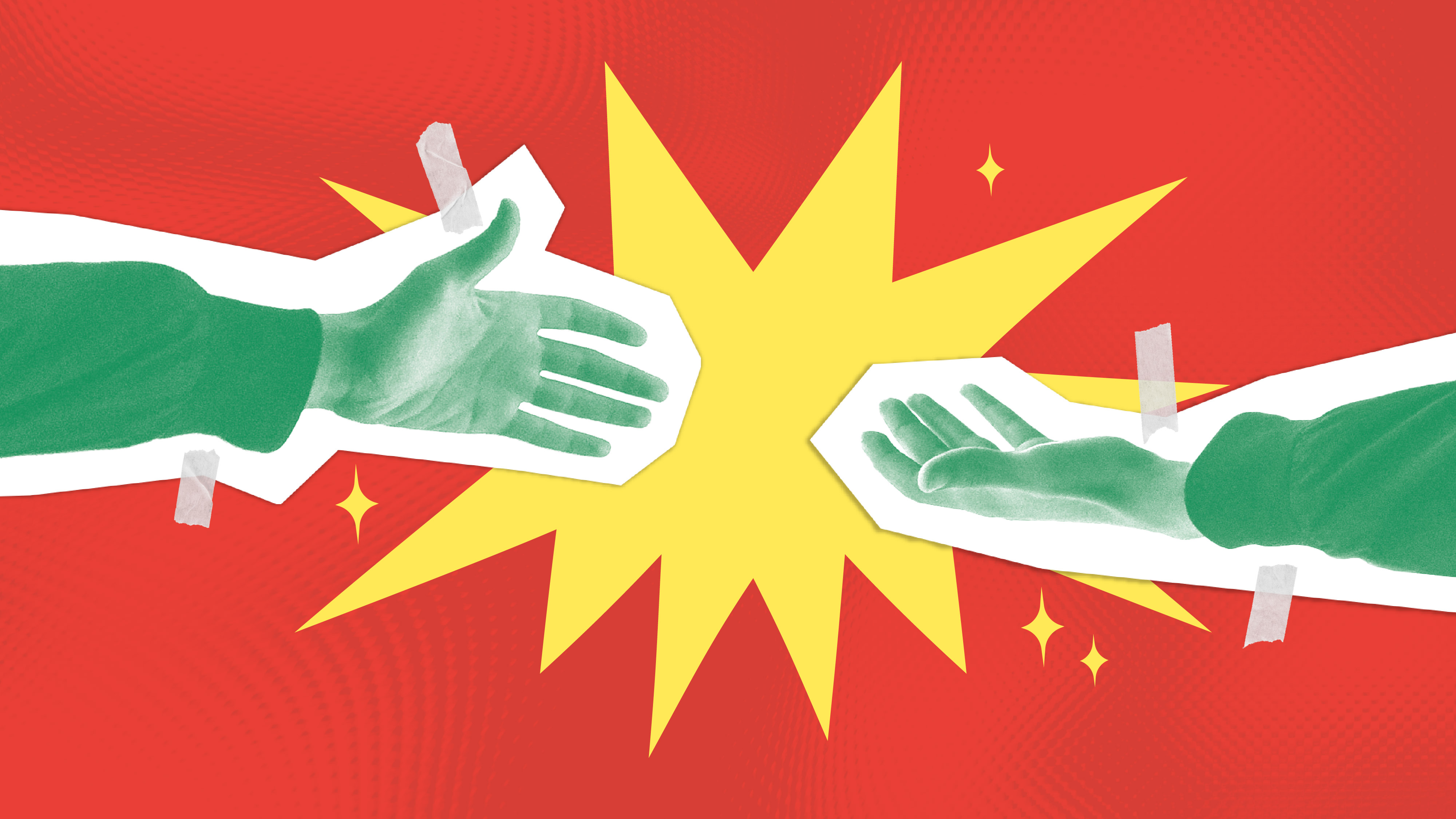
The selection of fonts I picked are all hand-written, and the style of the logo, along with other elements of the brand, use thick, angular lines reminicent of hand-carved linography. This is meant to invoke the idea of grassroots advocacy through the handcrafted medium used in punk political movements to create art such as graffiti, posters and zines.
The leadership of the bell club decided early on that the title would remain in lowercase, to pay homage to bell hooks, the late advocate and educator who inspired the creation and the namesake of the club. It is also a friendly, easy-to-read look, and the simplicity of the stylization makes it immediately distinguishable. The figure with an afro represents bell hooks, specifically in the recognizable era of her youth. Flowers represent growth, renewal, and rememberance, and the book represents knowledge and learning, which are all concepts that the bell club stands for.
The leadership of the bell club decided early on that the title would remain in lowercase, to pay homage to bell hooks, the late advocate and educator who inspired the creation and the namesake of the club. It is also a friendly, easy-to-read look, and the simplicity of the stylization makes it immediately distinguishable. The figure with an afro represents bell hooks, specifically in the recognizable era of her youth. Flowers represent growth, renewal, and rememberance, and the book represents knowledge and learning, which are all concepts that the bell club stands for.
suhaylabatal@gmail.com
Cincinnati, Ohio